Showing posts with label Mini Brief 1: LCA Newsletter. Show all posts

Thursday, 21 October 2010

Final newsletter & evaluation


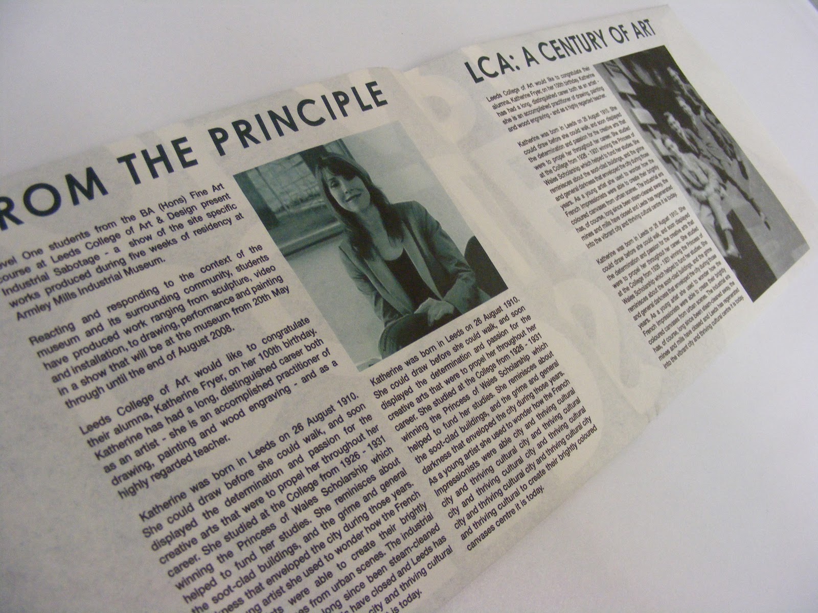
The Final fron and back of my newsletter. It is A5 fold out to A2 and uses Helvetica 8pt medium with the headers being Century Gothic bold italic at 18pt. The title on the cover is at approx 30pt to help give the design an immidiate look. I aimed to reflect a broadsheet look with my fold out;


To achieve a broadsheet look I used wide columns making sure i incorporated my images into the grid alongside the type. I made the layout in such a way that as you fold the newsletter out you get a continuous strem of information that culminates in the viewer finding out when the open times are on the back poster.


I did shock myself with how quickly I managed to conceptualise this brief and also turn it around for print successfully. Its definately made me see what is possible in terms of completing something that has a tight deadline and I definately will be doing more mini briefs like this alongside my larger more comprehensive briefs. I looked at the Don't panic website last night to see if there is anything to do, but at the moment there isnt. but as soon as there is Im going to start turning round their competition briefs everytime there is one as well as submitting illustrations to the Juice Magazine and Designer violence.

Design Directions For LCA Newsletter


This was the first direction i took on, where i broke the grid. I changed this quickly because the amount of type of both sides didnt feel balanced enough and the overall look felt too sporadic. The headers on the article arent working here either, they arent uniform and the design rules arent working well enough on this direction.


This direction felt much more realised after I had done my development design sheets. After folding this up I realised it didnt work as I said in my previous post.


 I had amended a few things such as the placement of the sub info type on the cover and changing around the logo in position. At this point the layout still wasnt working comfortably and after a feedback session with Jane I decided I needed to move assets around to make for a totally uniform visual look that runs all the way through the newsletter.


This was the final layout. I think for the purpose the newsletter needs to serve, my resolve works. An initial worry I had pre crit was that the colourway i chose for my final design direction wasnt appropriate because It was too dark and possibly dingy, but the feedback I got was that it works well and is appropriate, so I'm going to keep it the same. I'm happy with the layout except for the fact that the columns and large headings conflict a little and two colums seem to nearly merge visually.


I will go into more depth about this in the next post.

Short turnaround brief: LCA College Newsletter developments


 Also See design developments & finals post for more information about this two day turnaround brief.