Saturday, 20 November 2010

Saturday, 13 November 2010
Progress with Ollies type

Here is the type Ollie produced at its resolved level, I think he has utilised the space well, and putting the emphasis on the word love was a nice touch in my opinion. We have discussed producing a Mucha style border for this image, as it stands Ollie has opted to do that. One more step and this poster will be ready to print.
A self negotiated collaboration brief with oli
Me and Ollie decided we wanted to be involved in the next book fair, and discussed using that as a change to produce something which has technical print driving it. We decided we wanted to print a run of 6 colour screen prints, and as I have alot of illustration at the moment we decided it would be good to use some of it within this project as well as my more comprehensive brief for paper scissors stone.

 I started by colouring this image using 6 colours. I went with warm tones in the end, but it would make it possible to turn this image into the feature for a 6 colour screen print. Both me and Ollie decided we wanted to use the side profile image as its a stronger image, and Ollie is currently applying a hand drawn type treatment and a border to the image, to frame it off and make it feel more wholistic as a poster, and hopefully more desirable when it comes to selling them at the book fair. At the moment the format we are thinking about using here is A1. We are both gearing this whole thing around challenging ourselves when it comes to print.
Here is what Ollie is proposing.


Ollie has started to work this up digitally, this is his current progress with the type, currently we have printed out greyscale proofs to discuss.

This is working quite well, but We have both agreed that Ollie can take the type resolve a bit further in therms of the form of the characters and in the way Ollie utilises the space on the page. I think its looking like a strong visual at the moment, and with finishing touches around the corner this will be ready to print, and no doubt printed, long before the book fair in March.


Here is what Ollie is proposing.


Ollie has started to work this up digitally, this is his current progress with the type, currently we have printed out greyscale proofs to discuss.

This is working quite well, but We have both agreed that Ollie can take the type resolve a bit further in therms of the form of the characters and in the way Ollie utilises the space on the page. I think its looking like a strong visual at the moment, and with finishing touches around the corner this will be ready to print, and no doubt printed, long before the book fair in March.
assets produced for rebel pin up across a variety of treatments

One of the first composition ideas I had, a one colour background for the wall with a striking image in the centre. Ive incorporated the PSS logo into her hair, centralising the scissors putting an emphasis on the fact that rebel pin up is a salon within PSS. This idea started in an effort the "bring the salon in line with the shop" which is what I was initially briefed to do.

I then thought that the wall itsself should be more engaging as this would be a feature wall where all the viewer's attention would be. I used lighter colours to keep the image looking overall feminine because another thing that steve said he wanted the imagery to appeal to women more than men because it is a salon predominantly aimed at women.

A similar idea for the background but using the PSS logos. This looks really boyish and i think it would appeal most to a more juvinile audience which isnt appropriate for the context it is supposed to be in, it's also not working as well as it could because the background isnt precise enough in terms of symettry. I also tried extending the afro into the corner of the wall, but i think it ends up conflicting visually because it demands too much attention, it is too bold.

I tried the PSS logos again, this time in their original colours, its far too busy as an image.

I went back to the floral pattern, because i think that is working well and makes the image more appealing overall. It was at this point that i made the decision that I couldnt use the PSS logos as a pattern for this image because as I said before it is too busy.

Different colour of floral, mainly to give steve a few different options against the chosen colour scheme. (The orange colour is supposed to be gold.)

I added in the lovebird and got rid of the PSS logos, it reminds me of pirates which is not appropriate, but the overall image is working here, it looks more successfully framed than the others have been.

This ended up looking like a joke, so I dont think this is a winner.

Simplified right down, getting rid of excess clutter , made me realise that this image works when it is simple without excess imagery all over it.


the floral pattern has been made brighter, which is working really well and ive now got the actual PSS logo icons from Steve, so I've applied them here. ill post them all up in another post which shows all the assets i will be using seperately.

I dont like this at all, it looks very unifinished and a bit bare as an image. On a wall it would probably come over as quite impressive but on screen it looks a bit lost as an image. I put the emphasis on the scissors to exxagerate the salon theme. (the same applied to the image below.)


I used the assets i produced ahead of the first meeting with steve here. I think this would look great on the wall, but the imagery might get a little lost and hard to appreciate, as there will be shelves put onto the wall, and it is also quite a small space.
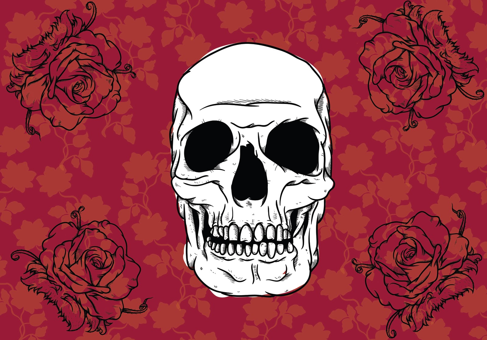


At this point in time, the image below is in my opinion the most appropriate and most successful looking compostion I have produced at the moment. At this point in time, a decision I made was that I need to include the rebel pin up logo on this image, probably on the scroll, but i will work that through in a sequencial process like I have here. I did have other compositions to post up, but I have temporarily ran out of storage space on blogger. Which is an annoying and serious problem which I need to adress.

I have produced a range of design directions using assets i created based onwhat was discussed with steve at paper scissors stone last week. The themes and ideas I was given to create imagery for were:
- Pin ups and classic imagery
- Floral, feminine, brocade patterns
- "boudoir" / "period" colour scheme
- Tattoo style approach & Visuals
- incorporate the Rebel pin up and paper scissors stone logos within the illustration / design.
Me and Steve also discussed doing something which puts more of my visual approach across and talked about iconic imagery such as a woman with an afro, scrolls, sugar skulls and flowers.
As soon as I have sorted out my storage problem, I will post up all the other design directions and feedback regarding the meeting i have with steve about these directions.
initial sketches based on research and dialogue with client.


These are the initial sketches I have produced based on some buzzwords steve at Paper Scissors stone game me in terms of visuals. These buzzwords were; Pinup, tattoo macabre, edgy, fresh. I have already been in once with some work ups based on these sketches but i will post them up afterwards. These two sketches show two design directions which were discussed by me and steve.
- 1 approach based on tattoo art which conveys macabre and edgy appeal
- The other approach has the same idea behind it, except with a character (afro clad woman) which I discussed in store with steve as an idea to do something a bit more exciting and challenging the more typical tattoo illustration approach.


I have worked all these sketches up digitally, my rationale behind this is that all the assets I am working with have to be fully scalable and versatile enough to spread across different applications to the wall such as:
Projection, vinyl stickers and wall paper (at a last resort).
Sunday, 7 November 2010
Thursday, 21 October 2010
Final newsletter & evaluation


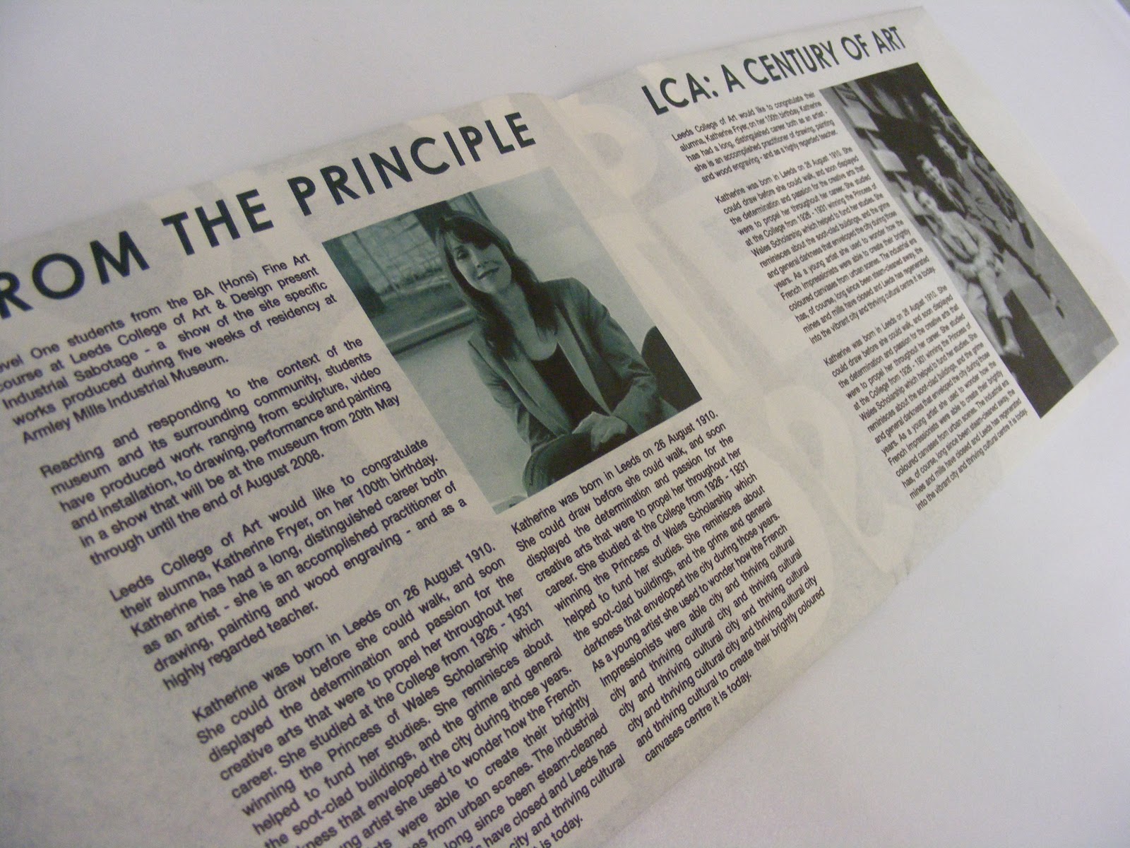


I did shock myself with how quickly I managed to conceptualise this brief and also turn it around for print successfully. Its definately made me see what is possible in terms of completing something that has a tight deadline and I definately will be doing more mini briefs like this alongside my larger more comprehensive briefs. I looked at the Don't panic website last night to see if there is anything to do, but at the moment there isnt. but as soon as there is Im going to start turning round their competition briefs everytime there is one as well as submitting illustrations to the Juice Magazine and Designer violence.
Subscribe to:
Posts (Atom)