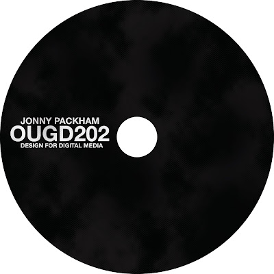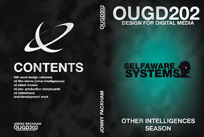

I decided because I am using a design uniformity that fits my audience the cover and the disk should be no different.
I tested a few different colours of jewel case fr this including clear, orange, green and cloudy. But black easily worked the best because it blends in with the cover and the disk and keeps it all tight. This cover also matches the booklet I did.
I'm happy with these designs and havent done any development work for them because they just naturally came out of all the assets I had and layouts I had been doing for the animations.

No comments:
Post a Comment