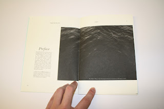
I thought it necessary at this point to produce a mock up that was as close to final as possible. A few inconsistencies need adressing with the production of this mock up which were:
- Image on page to does not line up with the way i cropped the page, this needs to be adressed.
- theres a few inconsistencies in how i've numbered the pages
- I was a bit inaccurate with the stapler
- I need a bleed on the document
- I need to make sure When i pull the glue on the screenprint, it has to be perfect to avoid the foil looking "rustic" I want it too look clean and crisp.
- Is the text on the back neccessary?
- Is the squid on the Front in gloss a good idea?
- Does the square format of the book itsself bother you?
- IS the visual approach mimmmicking an encyclopedia in terms of book design? Why?/Whynot?
- Do the stock variations work?
- Any ammendments you can see with the type?


I need to get myself into a crit with more type driven people than image driven I would say, because hearing feedback about my type and layout will be more important to me that hearing feedback about image and print at this stage.
ReplyDeleteFor me the more stylised Illustrations used do not match or link to the more traditional style typeface and layout used.
ReplyDeleteI think this is easy fixable though, for instance a more contemporary layout style and typeface could be used to create more of a visual consistency, Or use photographs or instead of the illustration on the existing layout.
OR have two design direction for two different audiences.
Perhaps in the more illustrative one you wouldn't have as much dry info and would be more about the illustration rather than the content.
And in the more content driven book you would have photography which gives a more formal, less stylised, factual feel.