Friday, 28 May 2010

OUGD 203 Evaluation

This brief for me, was the most challenging brief I feel that I have done yet on the course. Which is funny because when writing the brief for myself I did feel like it would be clear and easy. I did initially struggle with what my brief actually was and it took a good few days to clarify what I had written and seperate out the different aspects of the brief in order to clarify the pretty muddled brief I initially wrote. I do feel that the brief I ended up running with still wasnt clear enough and did set me up for plenty of falls along the way, but it was good to be able to do a more layout focused product lead brief in which image was the secondary focus.

At the start of the brief I got very interested in researching records, design for records and logos and identity. It was helping to inform aspects about the design which I do often overlook such as secondary information like copyright, RPM, A side, B side etc. I think by considering this - despite the simplicity of this it helped me synthesise and replicate a legimate and professional looking set of end products. Altough, these products could have been a hell of alot better. I noticed alot of schoolboy errors with the layout of the back of the record sleeves and they could have been more innovative - which is the main reason im not really happy with the end result of this project; I definately need to spend more time on layout. I researched most aspects of what I was designing for to a point, But I think to inform me better in future I need to extensively look into a wider range of sources which relate to what Im doing in other ways - not just because it is the same thing, for example I coule have looked into motion graphics for visual research despite the fact I wasnt doing motion graphics. I also feel that The extended range of products was somewhat of an after thought and could have had alot more thought put into it. This is why ultimately I do feel that I've done a standard project and failed to push it into them more special stages.

I think that I havent evidenced my work correctly throughout this project. I should have been documenting every decision I made instead of just taking the design decisions as red - as fred said its good to get the bad ideas out  and then the good ideas grow out of that, and I Just didnt evidence enough of my bad ideas, which is stupid, because it only detriments me. However I think a key aspect of the success of the final products was down to the large amount of mock ups I made throughout the project covering a few different design directions to let me see the design working in context. Im also happy with the way I dealt with I fell like i've learnt so much from doing this project, coming out of the collaborative brief with Ollie - who is very attentive to the small details and gave me some really good habits.

I decided early on in the project - mostly due to the time of year and organising myself, that I wanted to use digital print methods over bespoke printing, for a few reasons;

  1.  Seeing the products in context effectively required me to produce and manufacture my products in the same way they do in industry - often being artworks digitally printed onto glossy / satin card for records.
  2. I have done alot of screen printing in the past and for me, it is less of a challenge as it is very easy to quickly generate alot of development work and I also havent really done much design for digital print througout this course - I wanted to see if i could get to a strong point with the digital work as I would with hand printed methods.
The answer to this was that I couldnt keep up with it and also producing a logo took alot more time than I initially thought it would. I suppose from there I instantly felt like I was behind the development of the rest of the work - despite pursuing a few design developments. I think also that because I set out in my brief for there to be Digitally available design development journals done instead of worksheets I felt like I had not got to a substantial stage with the finals. The finals themselves are produced to a high standard and fit well in their context but they are nothing special, and that is down to the way i tackled research and design practise.

I have learnt a valuable lesseon : If you feel like youv'e messed up, you probably have. I am pretty sure I did. But knowing that gets me excited about the third year and I think I am at the point now where The design can happen.

5 things I could do more effectively next time:

1. ATTEND all timetabled sessions
2. Evidence all my development work
3. Experiment with different design directions more
4. Bring more developmental work to crits
5. Spend more time on layout.

Time management and organisation.

In terms of the project itsself I worked really well and was very organised in terms of meeting personal deadlines. I set the first two weeks aside for logo development and research after writing the brief.  I finished this earlyer than I expected so This gave me a week and a half to develop physical products which then left me a week to develop and produce further developments such as a mailshot and also deal with the boards. In terms of what I got done and what I set myself to do, I managed this project efectively - the only things that let me down was the evidencing of development work.

YCN collaborative Boards - My roles and responsability.

Thursday, 27 May 2010

Final boards for submission

 
Here are The presentation boards for submission, I think that these are a bit light in terms of information and only seem to show my development s in the second half of the project, but because everything about the first half of the project in terms of research and development is up on the blog,  i thought I would submit a product and brand pitch. the physical boards are... well, shocking. I think that the type on the boards is too big, and If smaller I could have fit more information on, and it would have had that little bit more of a professional edge.

The printing of these boards was also a bit of a nightmare. I rand out of money to fund this project and had to print onto A3, this would have been fine if I could have done thi on illustrator using the page tool on the A2 documents to segment them into equal A3 documents, but I created the boards on CS4, and then tried to print them in the mac suite, shich uses CS3, this created too many problems for me to successfully manage to use illustrator properly, So I decided to open the files as PDFs in photoshop and print the two seperate sides. I actually printed off a left side, a right and a center A3 off for each board, because borderless printing is not achievable in the mac suite ( well as far as I know.) and I needed to compensate for space I would loose because of the image cropping. Then it was just a case of matching up the images so they were straight, and cropping the mountboards down to A2 by hand.

Wednesday, 26 May 2010

Promotional artist t shirt


Some layouts for the promotional T shirt artists would wear to represent the label whilst playing out at a gig under the name of Alius, or if a venue had booked the artist via the Alius website. The large centralised full colour image on the shirt seems to be working best because it is immediate and simple - but sitll interesing and uniform with the rest of the products.

Alius branded company van!

Some experimentation with application of the logo to a van ( well more specifically a land rover)
I liked the land rover and thought it was really relevant because a banger like thi relates more to a roots music label than a spick and span sports van. The Large pictogram logo closest to the front door is working best as it is immediate and simple, also works with the form of the van. I dont like the pure type on this van because the form of the van is complimented by the circular form of the pictogram logo.

Tuesday, 25 May 2010

Strong contenders for the presentation boards: product in context.

mailshot

 
This mailshot would be sent out to record shops and also venues that have been targeted by Alius to be relevant and applicable to the music on the label. This mailshot showcases the labels identity as well as supplies all the information needed to get business or at least recognition. The following:

  • Business card, portable details - website adress and email adress
  • Compliment slip, mailing details and a brief introduction about Alius as a record label.
  • Free sample CD, used to showcase the artists on the label.
  • Free poster, an extension of the Alius branded identity's promotional products, these could be stuck on ad pillars or around the streets as part of a promotional campaign for their first release.
I think that the mailshot is working more successfully that the record sleeves in terms of its function because it has within it everything that a mailshot promoting a record label needs and because the target audience for the mailshot is high brow, being record shops and venues - it would be viable that alius would be happy about sending out slightly more expensive mailshots.

Monday, 24 May 2010

web page proposals

This is the homepage, The type is now all working at the right size compared to previous posts, and i chose include the information about the follwing:
  • New releases, the brand is moving to vinyl and has just released its first range of vinyl records therefor its important that this is known on the homepage of the website as the first thing you read.
  • The limited edition CD, this is more of a collector's item and is part of the same range but isnt available on iTunes and can only exclusively be bought from the website.
  • The iPhone app. This is a promotional tool to keep fans of the music and followers of the label updated with when releases are coming out to be distributed.


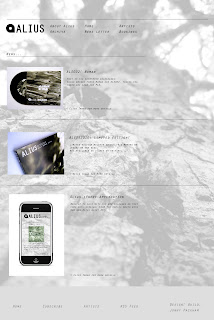
A page from the navigation bar: New releases, this page catalogues all the products including the special edition item in the range. The viewer is encouraged to click on an image of the product they are interested in for more information...


Once the viewer has clicked on a product, they get a more in depth look at the item, with a selection of images to view, and a sample of each track to listen to. underneath are products in the range which are related to the seleted product, for example the viewer is looking at skips 12"  so it shows the range of 7" products including the skips 7" record.

Alius web mock re-worked

I made a few tweaks to the page just to see if it would work better and it seems to be.

  • Got rid of the transparancy filter on the logo type in the top left of the header, I also centralised everything and shrunk it down by a little. I changed the type from 18 point down to 12 point in the product information and content, but left it at 18 for the navigation bar. It's working alot better, but I think more tweaks will be needed.

website developments 2

As I said before in the other post, everything is currently too big to be a website at the moment, it all needs scaling down as you can see.

This is starting to work more effectively now as a website, The type is still too big, but here are the other parts of this page: