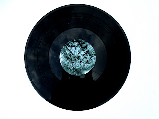
Here is the sleeve inside a plastic protective sleeve. This would look really good if the products were displayed like this in a record shop. It also serves the product well functionally.
I think that I just about get away with the white text on the back of this sleeve, the lighter parts of the image are just dark enough as to not get in the way of the white space. Again, I was really happy with the clarity of the images, and how they came out in print. Again all the type is clear and legible but also the copyright information isnt the first thing the viewer notices, which is really important.
With the stickers it was still important to have the copyright information there and I didnt have enough space on the 7 inch stickers to include it all so I had to condense it on the 7 inch record in order to be able to keep the type at 7 point. It all fits nicely on the 12 inch sticker.
Subscribe to:
Post Comments (Atom)


No comments:
Post a Comment