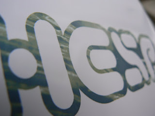
Here are some mock ups of the record sleeve for Hesp just using different images selected from the set that I took and then put into different colourways by using a duotone. The pink definately isnt working, reminds me of acid funk or something, definately is aparant that brighter colours can't work for this. I need to use darker colours to get a more effective look and also to contrast the reversed out type. The type hierarchy has also been amended here, the only thing I need to correct now is the logo. Below are the ones which are working best. The three colour schemes I choose will be applyed across the range of artist's products in 7", 12" and CD format. I have also decided that I want to use a different image for the record sticker to what is on the record sleeve. So each artist will have two images.
These are printed onto a lightweight matt card stock. These two are the most successfull here and I think the thrid in the set should be my original photographic mock up, the three colourways work nicely as a set, and the imagery ties tham all together nicely. I tried to print these out onto a lightweight glossy card, but this failed to be honest. The colours just didnt work. This is probably also down to my rubbish printer, it didnt even pick up any of the small print. Anyway, here they are. The gloss does make them look really nice!
Subscribe to:
Post Comments (Atom)


No comments:
Post a Comment